Rebooted Samic Telecoms' brand without touching the logo ;built a consistent design system, flyers, icons, and merch that finally made everything feel like one brand.

Client
Samic
Role
Brand designer & Content Strategist
Duration
1 year
Scope
Brand reboot(Visual Design)
Overview
Samic Telecoms is a VTU/digital services platform (samicsub.com) under Samic Idea Multiventures. They had a logo and a recognizable green, but nothing holding the brand together beyond that.
The Challenge
Samic Telecoms had a logo, but no real identity around it. Designs varied from post to post with no consistent system behind them. On a platform where people trust you with their money and airtime, that inconsistency read as unfinished, even though the product worked fine.
No visual system — every design felt like a one-off, not part of the same brand
Underused color — the brand green existed, but wasn't being used with any consistency or range
No brand assets beyond the logo — nothing built out for flyers, icons, merch, or social

The Approach
Reboot, not a rebuild
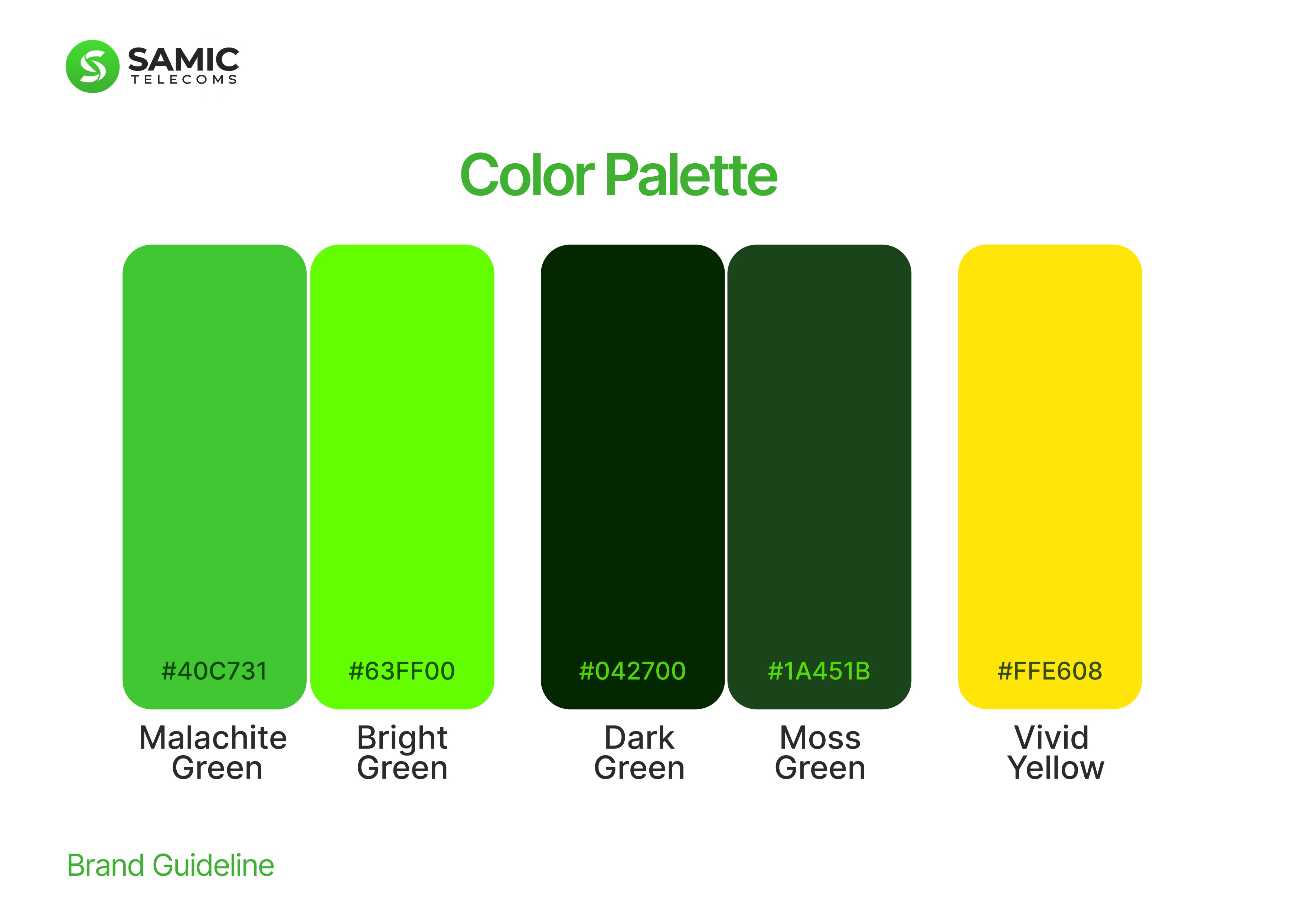
Kept the existing logo; it didn't need to go, it needed a system around it. Expanded the color palette slightly to give the brand more range without losing what people already recognized.
Building the system
From there, built out the actual infrastructure of the brand: a full design system, color, fonts, flyers, icons, and merch, all pulling from the same visual language instead of being designed one at a time in isolation.


The Results
Samic Telecoms became instantly more recognizable. Every touchpoint, socials, flyers and assets now reads as the same brand, instead of a collection of separate designs loosely wearing the same logo.

